Results

Projects, told through coherence

This section gathers the case studies: the starting point, the fractures identified, the choices made and what changed.

Case study 01

Pathé Suisse

Cinema as a premium experience

Spreitenbach, 2024 (completed) · Geneva and Lausanne, from 2025 (final design stage)

Concept, creative direction, rebranding of the premium areas
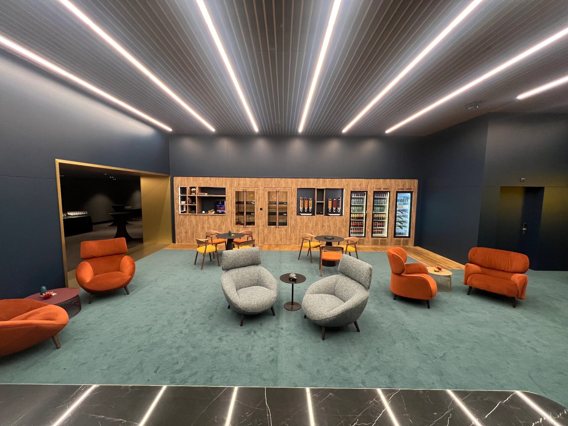
The lounge, overview
03 — The lounge, overview

01 — Context and promise

Pathé offers a high-end cinema experience in Switzerland: private areas, dedicated service, auditoriums with lounge seats and beds. The experience has to justify the ticket price before the lights go down.

The promise was stated. It needed to become visible in the space, the materials and the name.

02 — The fracture map

  • Identity — the premium areas were simply called “VIP”. That was a label, not an identity.
  • Space — waiting for the film was a transit, not a place.
  • Material — surfaces did not express the level of the offer.
  • Experience — light, sound and comfort had to work as a single ritual.
  • Narrative — nothing prepared the guest for the film.

03 — Choices and results

Spreitenbach, 2024: completed

I led the project from concept to completion.

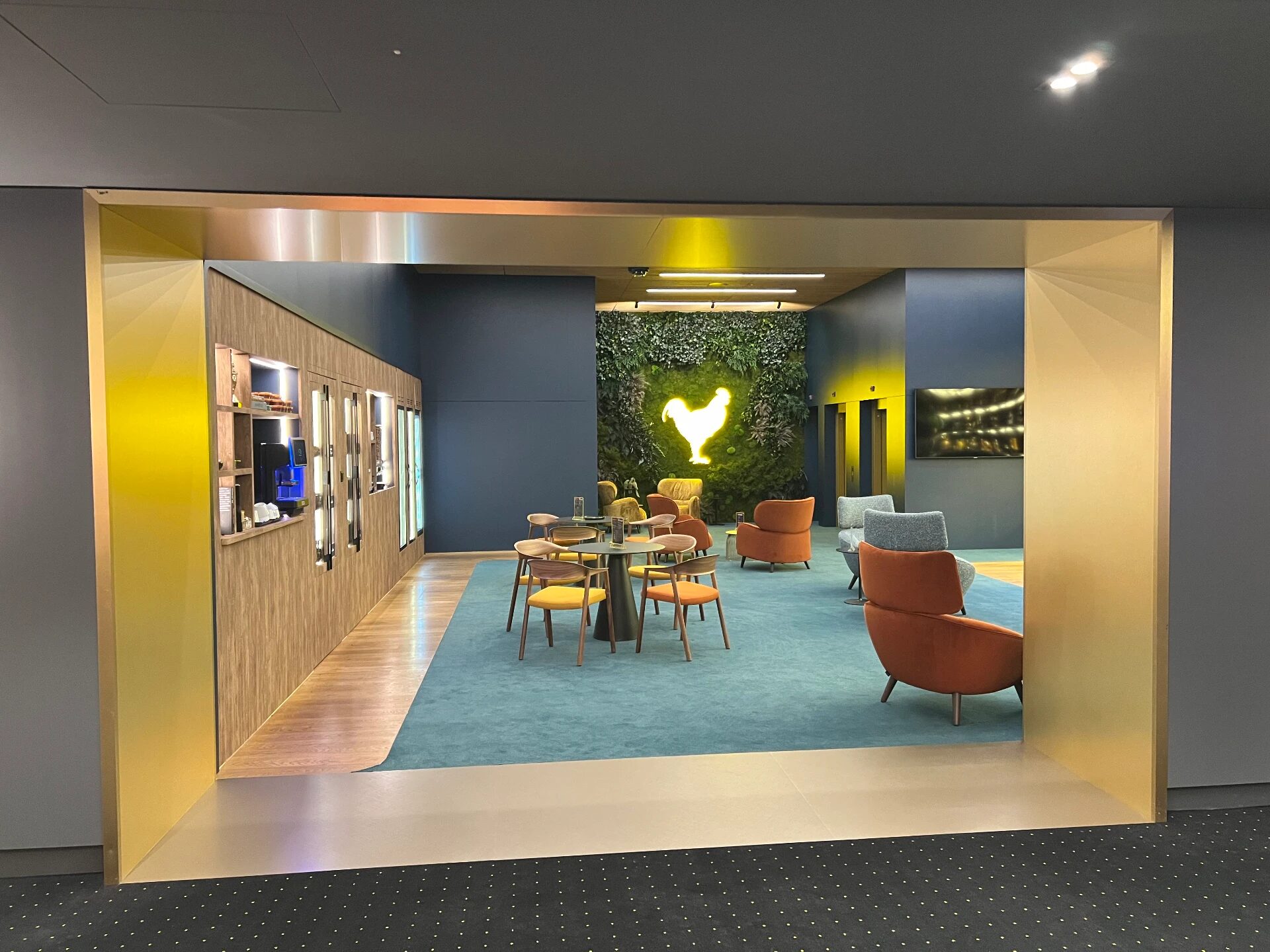
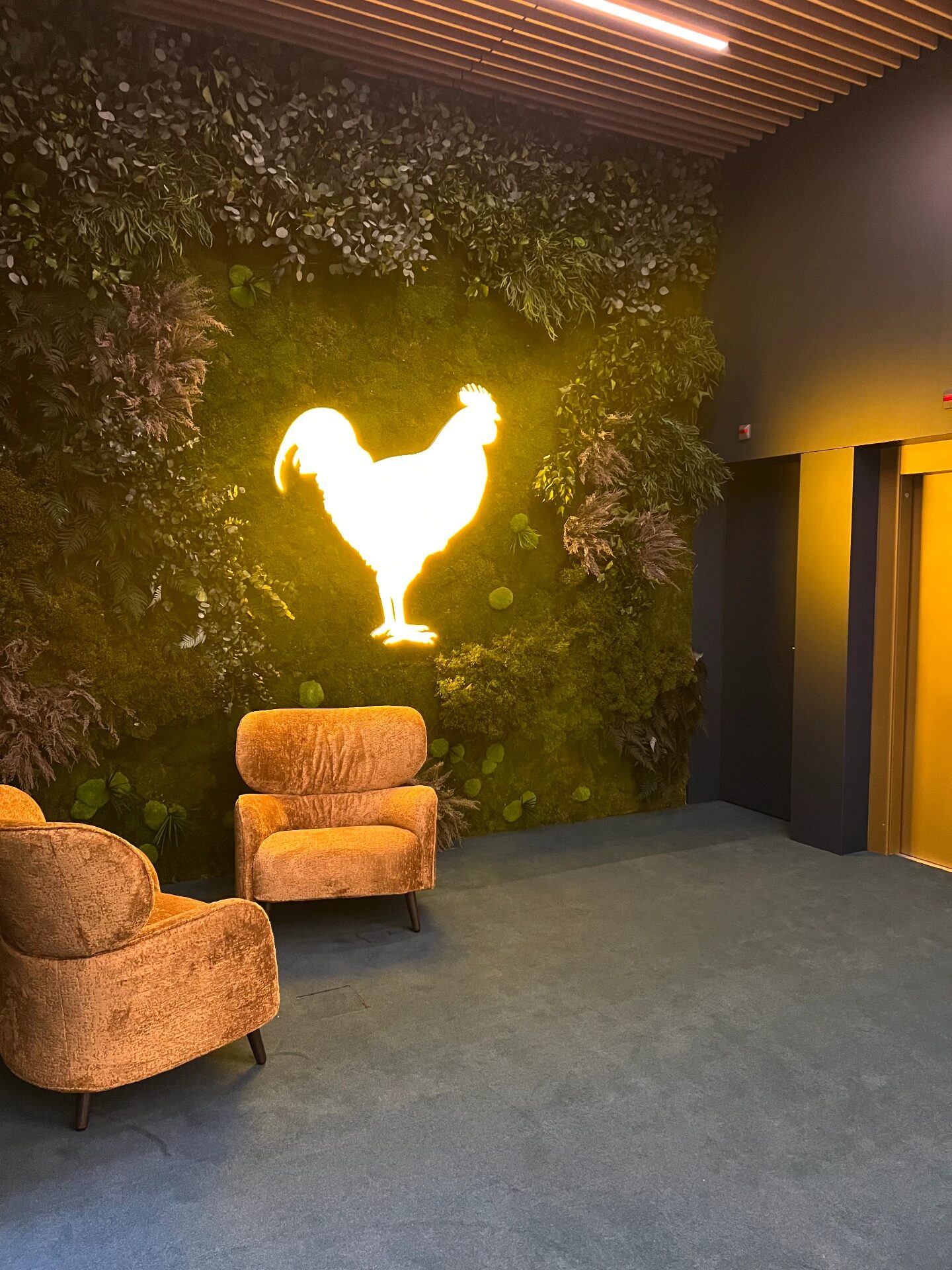
The journey begins on the lower floor, between a wall of moss and lichens and suspended swings, where time already starts to slow down. Guests take the lift up, and when the doors open they face a preserved green wall framing the backlit Pathé logo. The brand becomes material, not decoration.

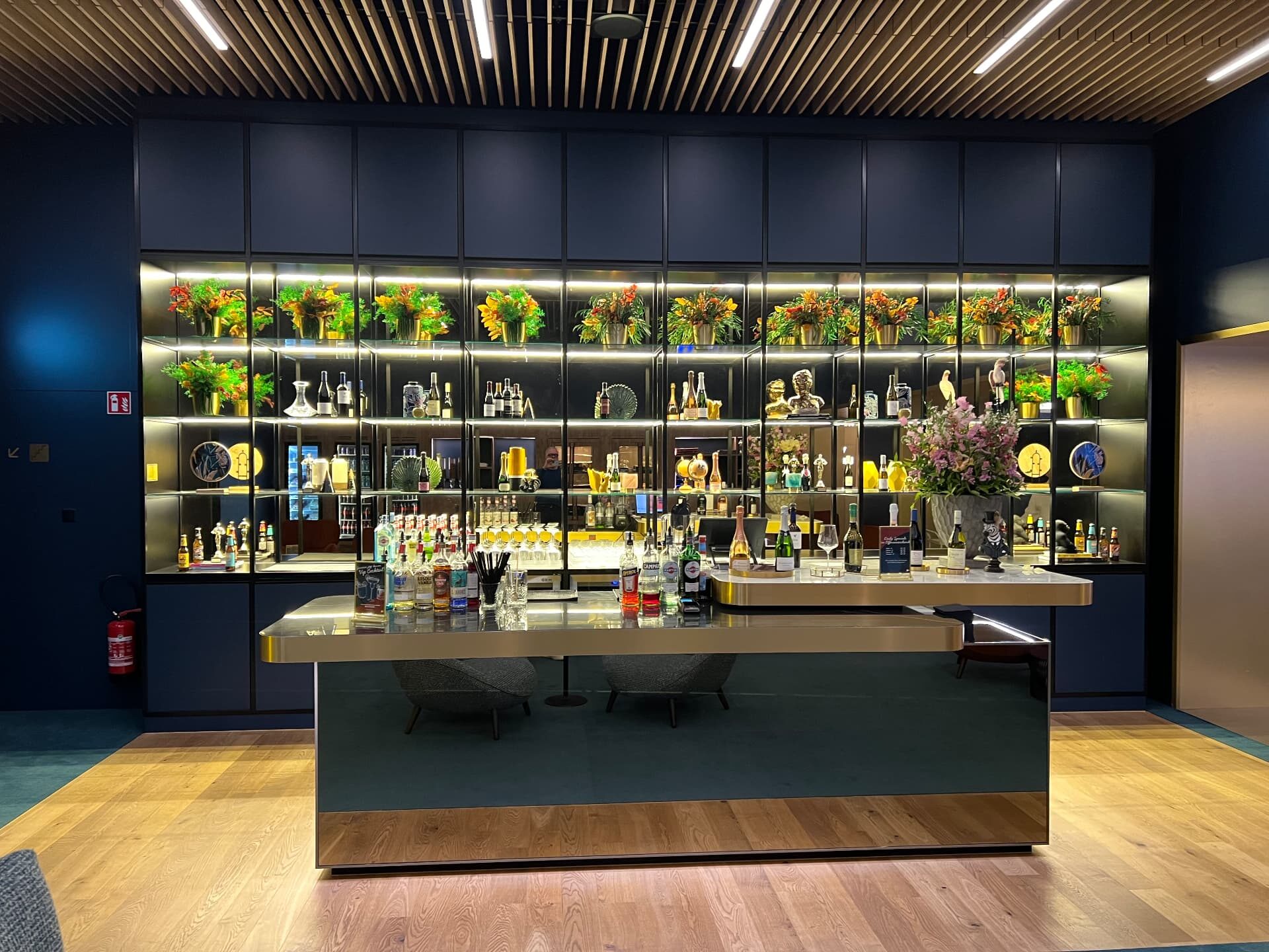
The lounge opens from there, with deep forest-green walls, petrol-green carpet, rust and ochre velvet armchairs and a slatted timber ceiling. The bar is a glowing showcase of bottles, plants and brass vessels. Guests arriving by the stairs pass through a golden portal.

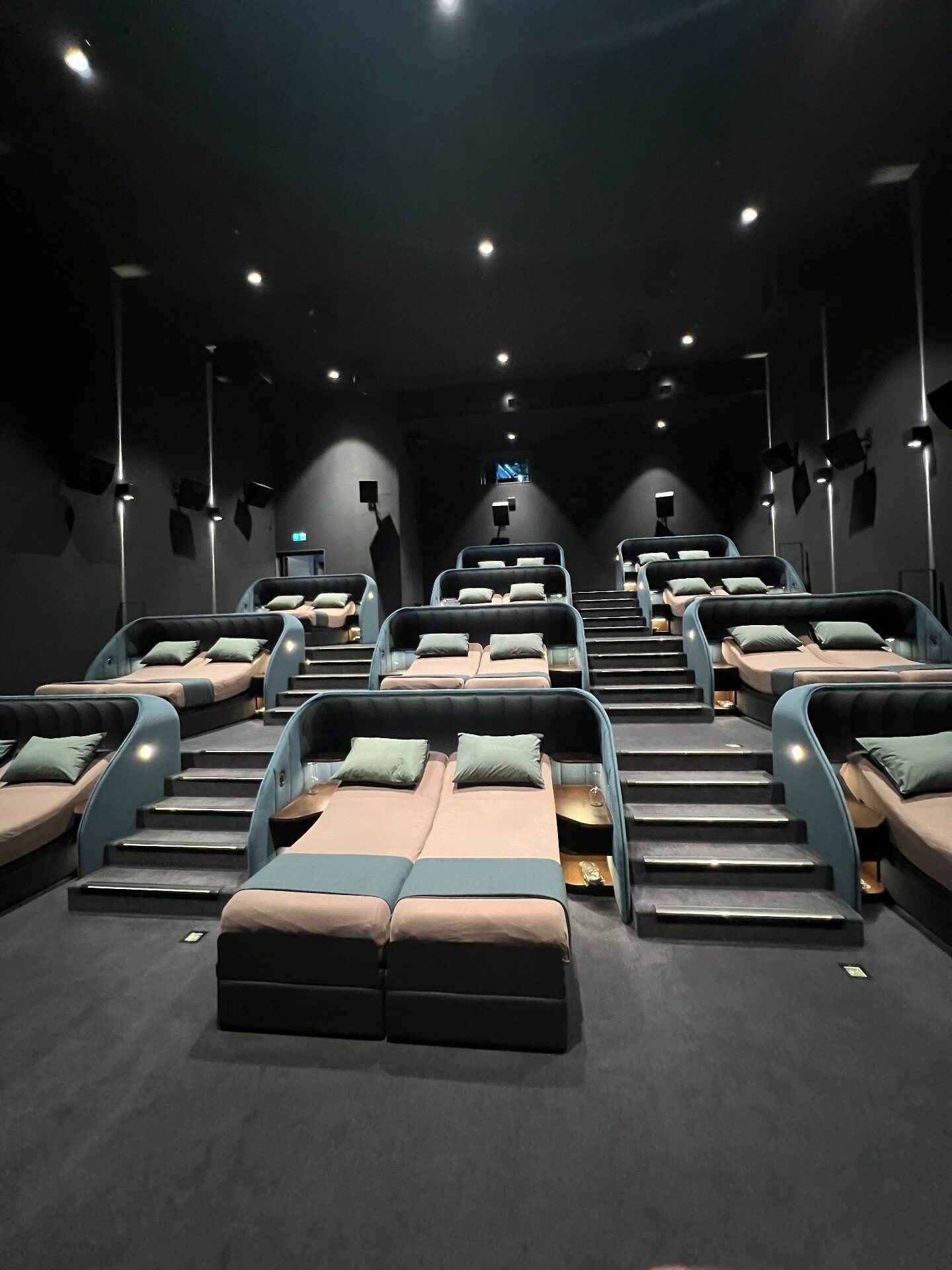
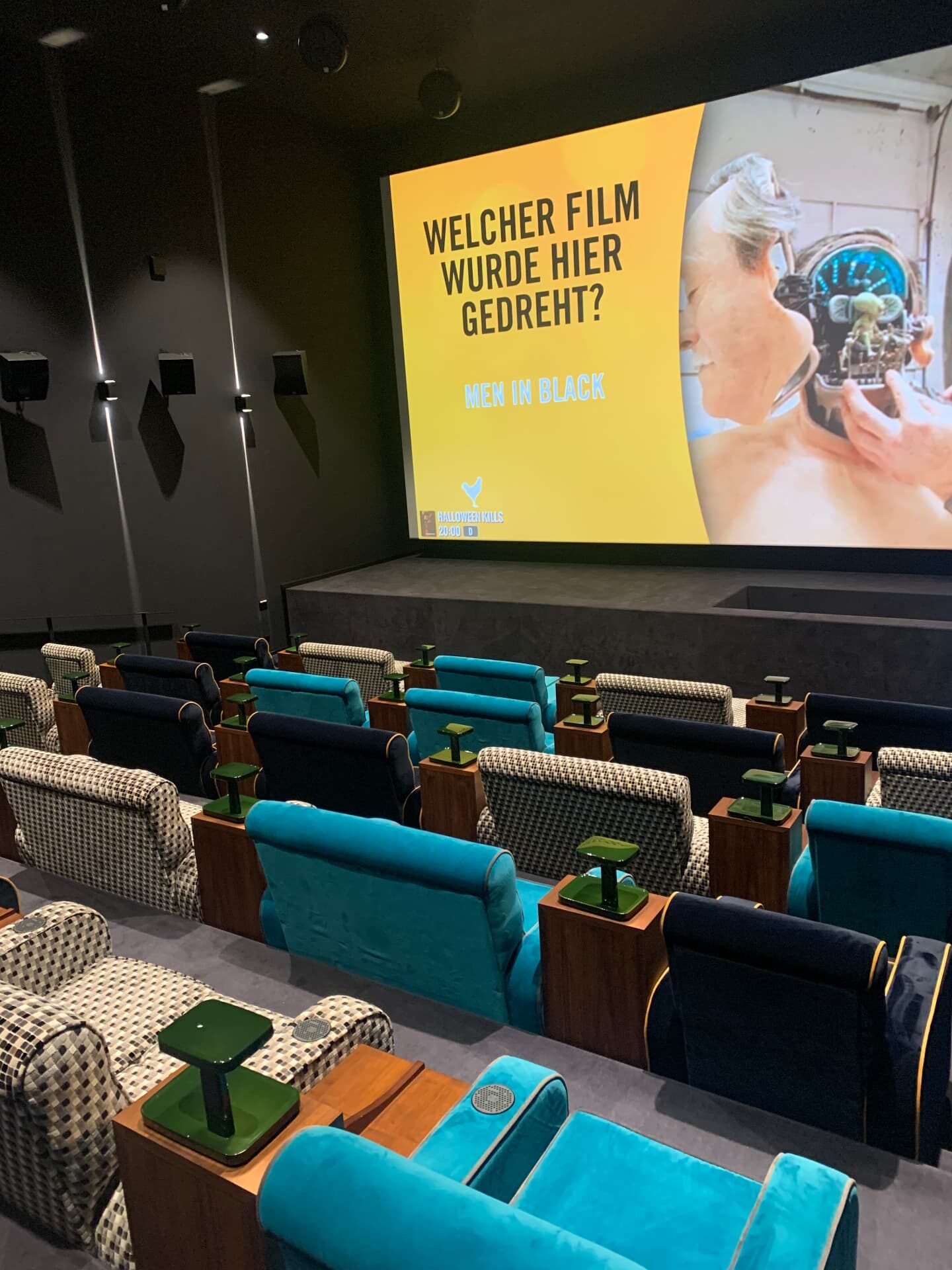
The atmosphere is Lynch-inspired, built on intimacy, anticipation and a hint of tension. It carries on into the auditoriums: velvet and houndstooth in one, beds in the other.
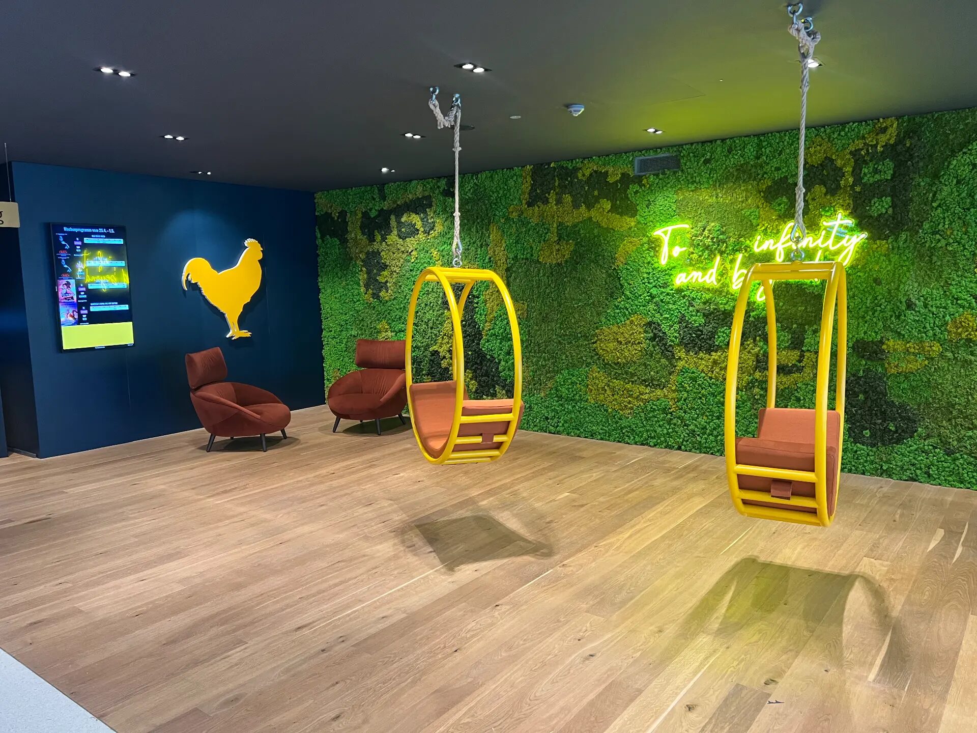
Lower floor: swings and wall of moss and lichens
01 — Lower floor: swings and wall of moss and lichens
Out of the lift: the logo on the preserved green wall
02 — Out of the lift: the logo on the preserved green wall
The golden portal from the stairs
04 — The golden portal from the stairs
The showcase bar
05 — The showcase bar
The auditorium with beds
06 — The auditorium with beds
The velvet and houndstooth auditorium
07 — The velvet and houndstooth auditorium

Rebranding of the premium areas

I developed the study to replace the “VIP” label with a distinct identity that matches the experience. The new name is awaiting official approval.

Geneva and Lausanne, from 2025: final design stage

I delivered concept, palette, materials and furniture guidelines to the architects, who are developing the construction drawings and overseeing the works.

What changed

After Spreitenbach, Pathé chose to extend the same approach to two new locations. The method became the model.

Spreitenbach, 2024

Watch the video of the space
Painted study

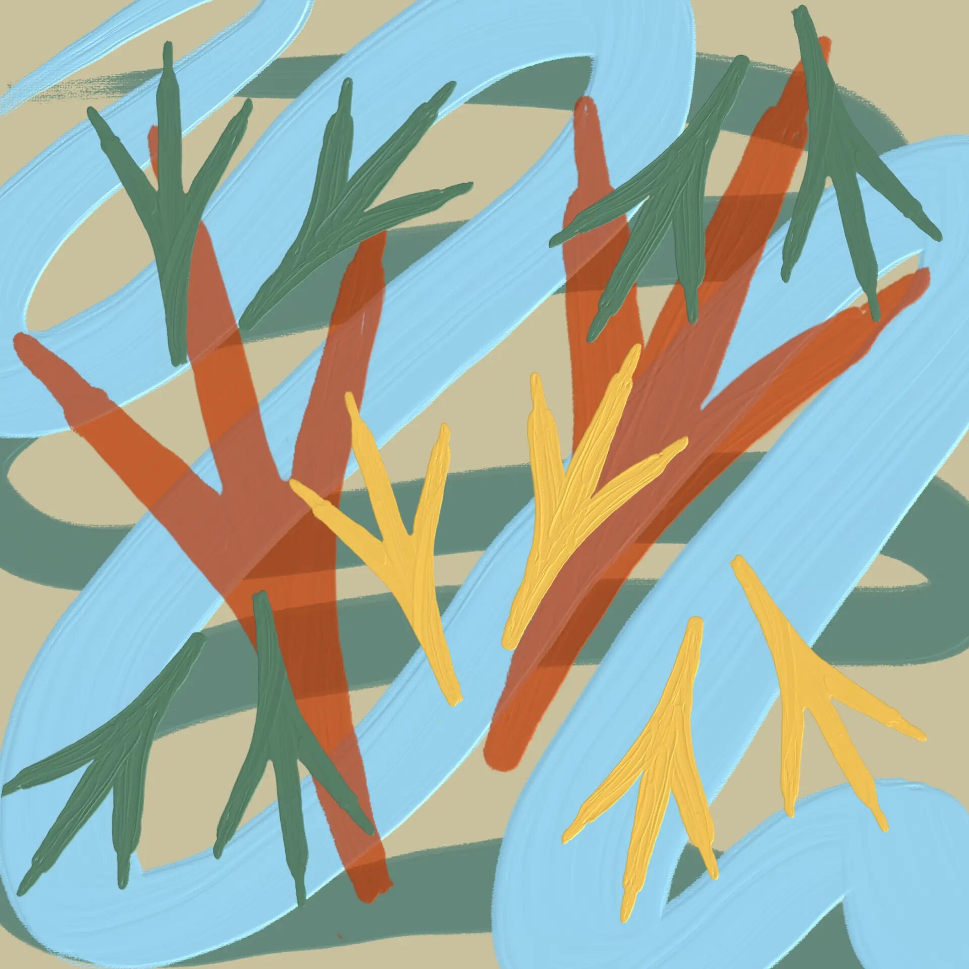
Painted study

A drawing born during the project, a repeatable pattern that holds in a few gestures the palette of the space: green, rust, ochre and sky.
Case study 02

The Cube Magazine & ICON

Editorial coherence between publication and partnership editions

Creative direction, visual identity and publishing supervision · 4 issues/year + ICON special editions

01 — Context and promise

The Cube Magazine is a periodical publication dedicated to architecture, interior design, and contemporary lifestyle, published four times a year. Alongside the regular edition stands ICON, a series of monographic special editions conceived as tailored communication tools for selected partners (such as the 10th-anniversary edition for Contract District Group).

The challenge: each issue and each partner bring distinct content, aesthetics, and commercial goals. The promise is to keep the magazine unmistakably recognizable as a premium editorial object, preventing commercial requirements from undermining editorial authority.

02 — The fracture map

  • Identity — Commercial publications often risk turning into promotional brochures: the partner must be celebrated within an independent journalistic voice, not through vanity advertising.
  • Space (Layout) — Page rhythm and visual breathing space: the grid must accommodate architecture, textures, and portraits without clutter or noise.
  • Material — The bridge between print and digital flipbook: tactile feel and screen reading must convey the same weight and typographic refinement.
  • Experience — Reading pace: guiding the audience through a seamless narrative where interviews, technical insights, and lifestyle coexist organically.
  • Narrative — Speaking the language of design rather than sales: elevating brand partners into design protagonists through an authoritative, critical lens.

ICON Edition · 1/2026

The magazine, page by page

A digital editorial experience designed to preserve the rhythm, weight, and refinement of the printed edition.

03 — Choices and outcomes

Creative direction as a quality filter

More than layout design: a comprehensive direction coordinating photographers, writers, and designers. Every issue refines palettes, accents, and visual hierarchy while preserving the publication's core typographic structure.

ICON: the special edition

A high-impact hybrid format that elevates commercial collaboration, turning a partner's milestone into a collectible piece of visual culture.

Coherence over time

Maintaining a refined, consistent voice across four quarterly issues while seamlessly integrating partner-specific special editions without compromising editorial excellence.

Case study 03

NONÒZIO

An atelier becoming a brand

2025 study · 2026 opening · ongoing

General Director: concept and brand guidelines

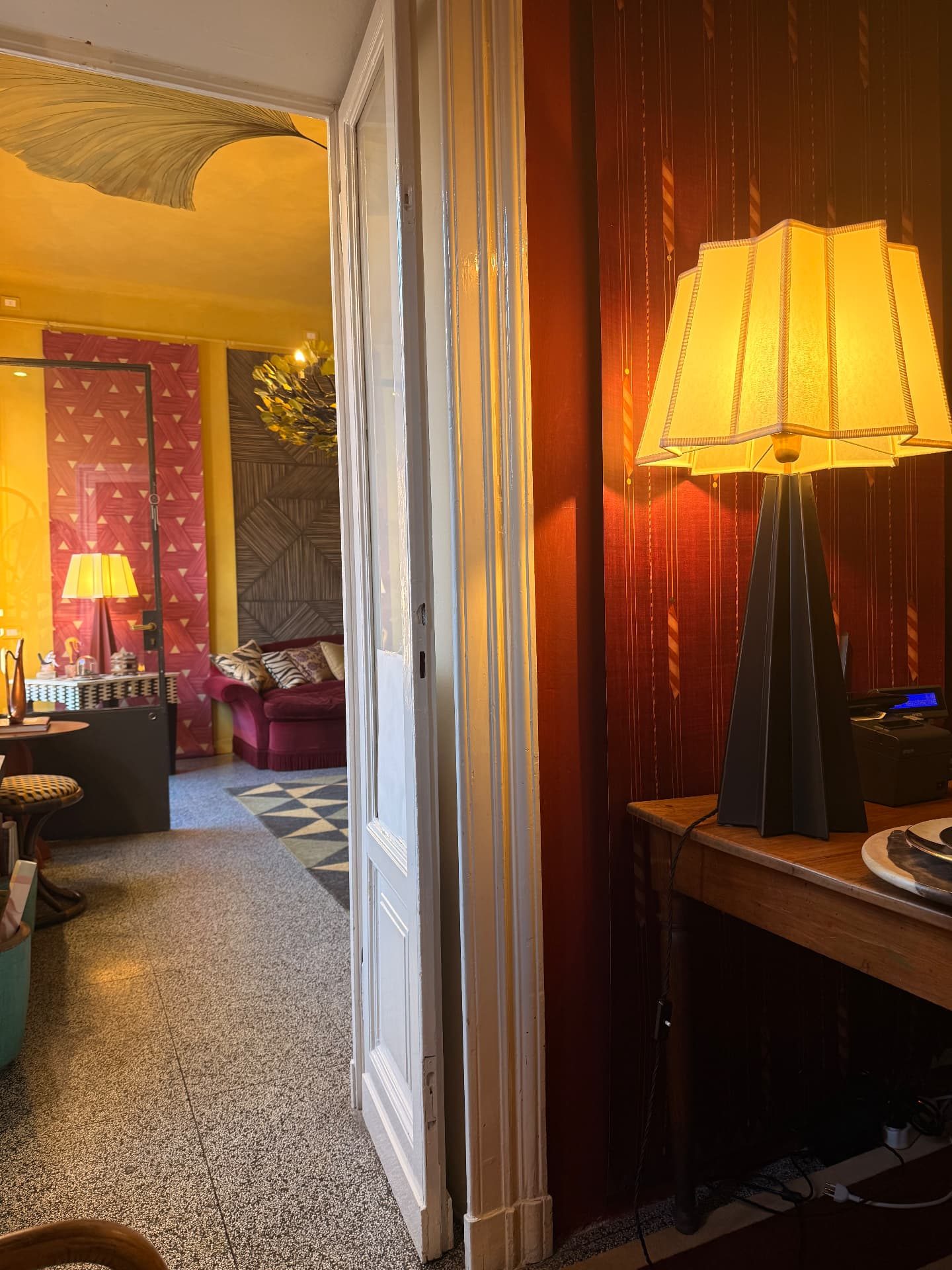
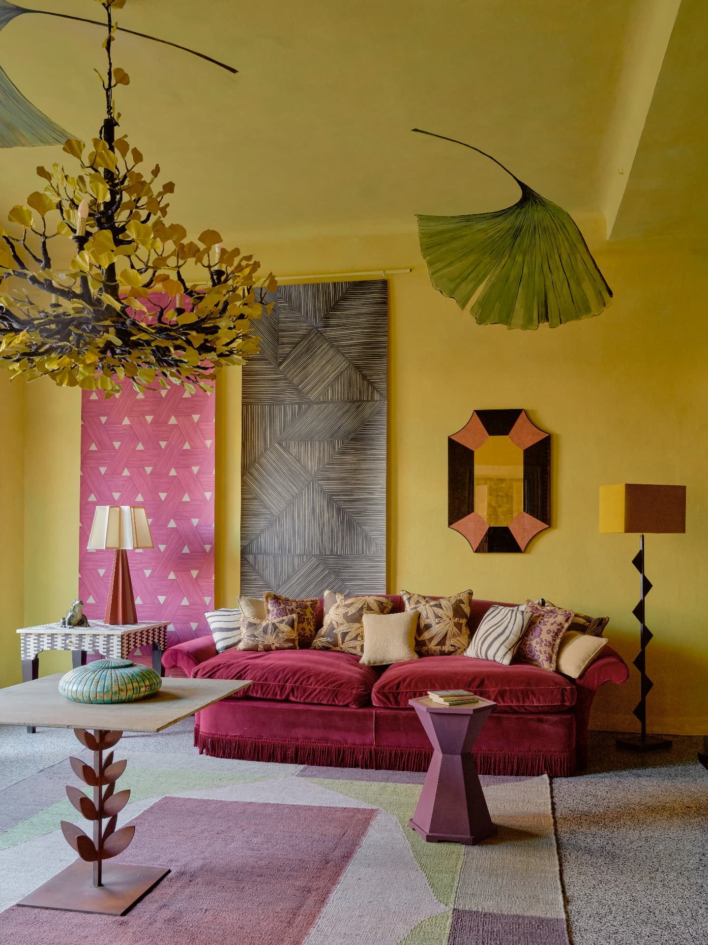
NONÒZIO, the yellow salon with velvet sofa and ginkgo-leaf chandelier
Project
NONÒZIO, atelier and interior design space
Location
Via Marsala 13, Milan, between Brera and Porta Nuova
Partners
Barbara Frua De Angeli, Pictalab
Role
General Director: concept and brand guidelines
Method role
Supervisor
Timeline
2025 study · 2026 opening · ongoing

NONÒZIO began with an intuition: to bring Barbara Frua De Angeli’s decorative eye and Pictalab’s production capability with Orsola Clerici and Chiara Troglio, the founding artists, under one roof, and to give that meeting a name, a voice and a recognisable form. I conceived the project and I am leading its development, with one goal set from the start: to turn an atelier into an independent brand.

01

Context and promise

A space on the corner of Corso Garibaldi, between Brera and Porta Nuova. Two complementary skills, one who designs and one who makes, surrounded by all the craftspeople who come into a home when it is renovated: from the lampshade maker to the upholsterer, from the painter to the artist.

NONÒZIO holds furniture, art and handmade pieces, objects that tell of journeys and memories. Just like a home. Stepping inside is a journey.

The promise: a place where interior design is not displayed as in a showroom, but lived, guided by the search for beauty, colour and craft quality. A space for both selling and inspiration, with a tone that is elegant, warm, direct and never commercial.

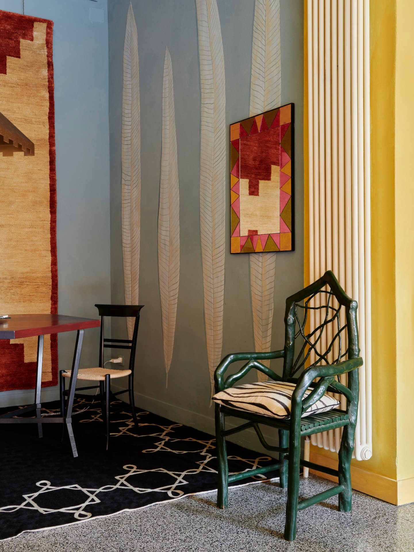
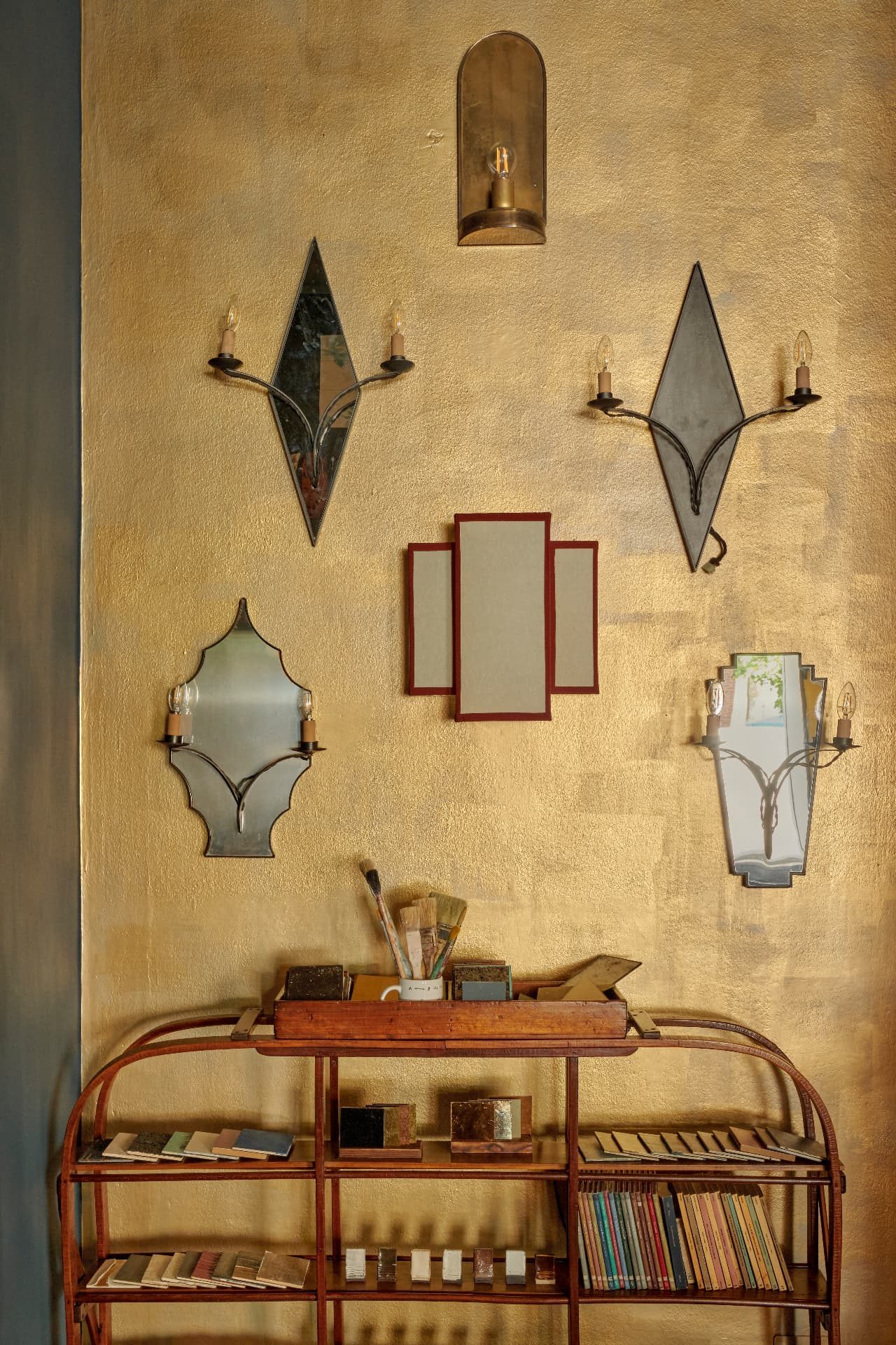
NONÒZIO, gilded wall with mirrors and sconcesNONÒZIO, lamp on red wall with view into the yellow salonNONÒZIO, green chair against the painted feather wall and rugs
02

The fracture map

The preliminary study, carried out in 2025 through the five lenses of the Coherence Audit, revealed where the promise was at risk of cracking.

  • Identity — The risk of being read as a manufacturer’s showcase or a designer’s studio, rather than a project with a voice of its own.
  • Space — A brand that was nothing more than an address. NONÒZIO had to exist as a brand, not only as a place.
  • Material — Hands, trades and objects of different origins, to be brought into a single grammar.
  • Experience — The balance between inspiration and sales: welcoming without pushing, selling without losing the tone.
  • Narrative — A new name with no history yet. A story to be written by taking away, not adding.

The priorities:

  • —build the identity before the space;
  • —define a single language, verbal and visual;
  • —make the brand independent of its location, starting with its own products.
03

Choices and results

The choices made:

  • —Identity and tone-of-voice guidelines: elegant, warm, direct, never commercial.
  • —A network of craftspeople and artists involved as part of the project, not as suppliers.
  • —A single visual language for digital content, with a pared-back Art Deco feel.
  • —Management tools: pricing structure and control of sales, costs and cash flow.
  • —A client relationship system designed to stay with the client after the visit.
  • —A launch during Salone del Mobile 2026, with dedicated price lists and materials.
  • —The first NONÒZIO-branded product lines.

What changed:

  • —NONÒZIO immediately drew its niche: people looking for beauty, colour and the quality that only craftsmanship can deliver.
  • —Strong footfall and sales, and a steadily growing flow of new contacts.
  • —From the circle that already knew Barbara Frua De Angeli and the Pictalab team to new clients who come for the NONÒZIO name.
  • —A strong international clientele, drawn by a Milan that now welcomes people from all over the world.
  • —A recognisable project with a name of its own, no longer the sum of two businesses.

This is the work I do. It is called coherence.